Sunday, 22 May 2011

Interior Design in Weddings

     Many events need an interior designer to design the layout and colour scheme of their event or party. Events such as weddings, need to find a colour scheme to follow so the different colours don't clash with eachother.

This wedding reception uses white with an accent of brown. Overall, the reception looks great. Everything matches with eachother and looks great. If there was no accent, there would be too much white and it would look too bright. We like this reception, we think it has the perfect amount of colour and looks good.


This as another example of a wedding reception. This one is obviously much different from the other reception. This one has more colour and many more decorations. We think this reception is okay if you're going for a "circus" wedding style. Personally, we are afraid of clowns and don't like this. We would feel uncomfortable in this environment and feel that it has too much colour for us.

    If you're looking to add some colour to an all-white wedding, center peices are the way to go. We like this center peice because the colours looks good together and they dont overpower eachother. Depending on what colours you want to use, you can choose from different types of center peices such as a bouquet of flowers, or a single flower in a thin vase. It can also be used as a DIY project, adding whatever you want to them. Just remember, make sure the colours match!

-Hayley, Vanja & Alexandra

Thursday, 19 May 2011

Desk Decor

We deiced to do an "officey" blog about desk organization. But not your average filing cabinets. We're talking about those little organizers that sit on top of desks. These types of organizers don't only create more space, but they can actually make a desk look better! But, our favourite part of on-desk organizers, is that they take that clutter off your workspace and create a cleaner, more appealing area to get your work done.


The first organizer that we chose is this paper and writing material organizers. This particular one is from Ikea, but you could find similar ones in most stores that sell office supplies. They cost around $15. We like this particular organizer for various reasons. One reason is that it has various compartments to separate papers into. This is really convenient because everyone hates to lose a small more in a sea of paper. With this organizer, you can separate those notes from everything else and know exactly where they are. Another reason is that it has various level so you can see what is in each compartment. Also, we like how it is a vertical organizer. This not only saves room but you can see most of the things you have inside the organizer, unlike a horizontal organizer where you can only see what you have on the top. Finaly, we really like the wick material that the basket is made of. It brings a more laidback, beachy feel to the average office space.
Something about this we don't like is that the vertical thing can make it hard to get to things at the bottom of the compartments, especially in the back one.


This paper organizer is very different from the first one. Again, these range in price but they're usually $10 or so. We like this one as well, but for very different reasons. One thing we like about this is the contemporary feel it has. This is a classic letter tray with a modern twist to it with the chrome mesh and modern looking racks. We also like how you could reach everything on this rack, unlike with the vertical rack where it could be difficult to get things that fell to the bottom. Some things we don't like about this organizer is that it would take up more desk room and the shelves are pretty narrow, limiting what you can put on the lower shelves.


This is the last paper organizer that we decided to feature. It is unlike the other two in that it's almost a mini filing cabinet system. We like it's modern design and think it's a really neat idea. Also, we think that it would be pretty easy to file through your papers and find what you're looking for. Some down sides, the papers might droop to the side, which wouldn't look very nice, and it could be difficult to maintain. We think that it could easily become messy looking, even if it's not.

As a final note, we decided to show a way to add your own personality to your desk. Picture always do this, but we wanted to get creative, and what better way then a small accessory with some flare! A pen holder is the perfect way to do this. Whether you buy them, make them yourself from old cans, or just use a coffee mug, a little pen pot on your desk will show something about you that a paper organizer won't; it will show who you are! There are lots of ways to do this are tonnes of great features, but the best? They're practically free! This just goes to show that you can add features to your workspace without breaking that bank. Just remember to keep the features true to your spaces theme, colour scheme, and, most importantly, yourself!

-Hayley, Vanja, & Alexandra (*Double Post)

Tuesday, 17 May 2011

Mongolie Grill

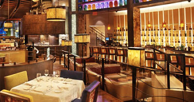
The Mongolie Grill is a restaurant in Whistler Village. When we were in Whistler in March, this was one of the restaurants that we visited. It was definitely our favourite. The design is really unique not only for it's design, but for the entire way that if works. It's not like other restaurants where you get to pick what you want off a menu and the waiter brings you your food. At Mongolie, who specialize in stir fries, you get to customize your entire meal. It's sort of like a buffet, as you go and build your plate with all kinds of vegetables, noodles, proteins, and sauces. Then you give your bowl to the staff and they cook it up on this big grill right in front of you! It's really cool!

Mongolie Grill is located on the second level of one of the buildings in Whistler, so that means that when you go inside the first thing you have to do is climb a few flights of stairs. The entire staircase is decorated with asian-style paintings. The lighting is quite dim and it makes you really excited to get up the stairs and see what the rest of the restaurant looks like. this is similar to many homes but very odd for a restaurant. Stairs right away can be a bit of a turnoff for people when entering a restaurant. Who wants to climb before dinner? but once you get up you realize it was definitely worth it! But there are some things similar about Mongolie to other restaurants. From the entrance you can hear the asian music playing, drawing you in, and there is also a menu and description on what the restaurant is about. That way, you can decide if it's something you're interested in trying before you go up all those stairs!

When you get up the stairs, this is what you see. The space is pretty small, for a restaurant at least, so the tables are pretty close together. Near the back there are a few booths and a bar as well. The eating area continues with that whole asian flare. There are a lot of paintings and the furnishings are modern but you still get the asian feel from them. This is different from residential design in many ways. In houses, extra space is necessary and having too much furniture is a major taboo. IT's the opposite in restaurants, as the more people they can seat the more money they'll make. Also, there is a lot of the same pieces of furniture, whereas in homes variety is good.


This is the grill sections. The large grill usually has about 4 chefs around it so that one isn't stuck cooking for 8 people at one time. The great thing about Mongolie is that you get to watch your food being made. The chefs put on a bit of a show with it too, flipping their spatulas and throwing them once in a while. But, though you get to watch them, there is a fence to give the chefs their own work space. This is different from residential design, where most people like their kitchens to be open and to prevent the segregation from whoever is cooking.

We really like how unique this restaurant is. It's design is simple but not too simple. You can tell that it's an asian themed restaurant without it screaming at you. Also, there are a lot of windows that have the beautiful whistler views. And, of course, our favourite part is the unique "kitchen." We love how you can see your food being made and control exactly what and how much you get. If we could change anything, it would be to make the space bigger. More seating with a little more leg room would be awesome, as you don't really feel as private as you would like. Some more booths would be nice too. But, given the space constraints, we think they did a really good job on Mongolie's design and would recommend it to anyone looking for a unique dining experience!

Hayley, Vanja, & Alexandra (*Double Post)

Friday, 13 May 2011

Caesar's Palace, Las Vegas

We chose to do our third hotel blog about Caesar's Palace in Las Vegas. It is one of the most famous resorts on the Vegas strip for it's luxurious style  and service. There are many features at Caesar's Palace, including many restaurants, pools, and even an art gallery. 


The entire feel of Caesar's Palace is evident in the lobby. There are large columns all around the circular room, each decorated with etched-in details. The marble floor has a mosaic effect with various designs and the lobby is centred around a greek-god-inspired fountain. The check-in desks are around the border of the room and there are various pieces of artwork depicting the greek gods on the walls. The lobby has a very extravagant feel to it, like you are stepping back in time. Any other place, we would think this lobby was way too over the top, but in Sin City itself, this theme fits perfectly. We wouldn't change anything about this lobby. It is supposed to be a spectacle, and it it exactly that.


In contrast to the traditional, extravagant feel of the lobby, the rooms at Caesar's Palace are actually quite modern. Each has a balcony that looks out onto The Strip. The rooms are mostly light colours with an accent in  a deeper, more regal colours, such as plum or olive green. The furniture is quite large, like in most hotels, and the wood used is mostly dark. We really like these rooms and think that even though they don't exactly match with the lobby, they work well because they too give off the feeling of luxury and elegance. If the designers had tried to make the rooms as Greek-inspired as the lobby, we think it would have been way too much decoration and turned from a comfortable room into something outrageous. There is one thing we don't like though, and thats the tacky patterned carpet in some of the rooms. We would take this out and replace it with a more neutral one.

 Bradley Ogden American Restaurant
Mesa Grill

There are 14 restaurants at Caesar's Palace. Though they serve different kinds of food, they all go with the theme of the resort. Each is elegant and don't feel like a typical hotel restaurant. Their design is similar to the of the lobby in that they have warm colours schemes and use a lot of detail, such as high ceilings, chandeliers, and intricate mouldings.

Overall, we love the design of Caesar's Palace. We think that it works perfectly with the whole Vegas feel and would love to stay there some time in the future

-Alexandra, Vanja, & Hayley (*Double Post)

Valentines Resort, Harbour Island, Bahamas

We chose to blog about the Valentines Resort in Harbour Island, Bahamas. Harbour Island is one of the smallest island in the Bahamas and it has very few resorts on it. This makes it very relaxing, the opposite from Atlantis. We really like this resort because its made up of little cabins which you can stay in, as well as a beautiful beach and restaurant.


The rooms at Valentines have a very warm feel to them. The colour scheme is accented neutral with mostly beiges in the bedrooms with coral tones in the artwork and some of the furniture. The pieces of furniture are quite big, so there aren't very many of them. This creates a laid-back, comfortable space. The rooms aren't very traditional or modern, but like many resorts they are timeless. In the cabins, there are lots of windows and balconies so the views and beach air come into the space and complete the beach experience. We really like that they haven't gotten too themed with the rooms, because that can look really tacky. If we could, though, we might add a bit more colour to the rooms. It is the Bahamas, after all, a bit more colour wouldn't hurt.


Unlike the neutral interiors of the cabins at Valentines Resort, The buildings and ground themselves are very colourful. The cabins are painted in pastels versions of typical tropical colours, such as coral, blue, and yellow. This fun addition adds to the care-free mood of being on vacations and relaxing. The pool is also really gorgeous. There is tonnes of greenery all over the grounds of the resort, from palm trees to tropical flowers. Finally, the beaches on Harbour Island are some of the nicest in the world, and the one in front of Valentines isn't any different. The white sand and turquoise blue water are beautiful, and there are plenty of beach chairs provided so anyone visiting can enjoy it for themselves.

-Hayley, Alexandra, & Vanja

Tuesday, 10 May 2011

The Atlantis Resort, Nassau, Bahamas

We chose to do a post on the Atlantis Resort in Nassau, which is the capital city of the Bahamas. We decided to look at the design of this hotel because we hope to stay there some time in the future. WE really like this hotel for the activities that it has available like the swimming with dolphins and the aquariums, but we also really like the interiors.


The lobby in the Royal Towers, the largest of the 5 buildings at the resort, is very ornate. There is a large amount of mosaic tiling on the ground as well as some mosaics on the walls. The pilars are very detailed and in the domed part of the room there is a shell design. We think that this lobby is nice, but it's a little too fancy. We like the more modern style that they have put into the lobbies of the other buildings, such as the cove and the reef, pictured below. To fix this lobby, we would redo the floors with a dark wood or maybe a granite, tone down the colours of the pictures, and replace the pillars with less fancy ones.


The Cove Atlantis lobby
The Reef, Atlantis lobby


The rooms at the atlantis are very nicely decorated as well. There are a lot of light, tropical colours used suck as lime green and reds. Lighter would are also used to compliment the beachy feel. The rooms are quite modern and simplistic with large pieces of furniture. The rooms give off a luxurious, plush feel that would make everyone comfortable to stay there. We really like the rooms and wouldn't change much about them. They have very open concepts and have lots of natural light. We love how there are so many windows, so you can see the beautiful island from your room.

Atlas Bar & Grill

Mosaic

There are many restaurants in the Atlantis Resort, all with different design themes and cuisines. Our favourite restaurants are those that have the same design concepts as the rooms; modern and open. There are also a few restaurants that are like the lobby of the royals towers, very ornate and fancy, but we don't plan to check those ones out. We love the dark wood used in these restaurants, the Atlas Bar &  Grill and the Mosaic. We think it makes them look fun and modern and they go with the hotels family friendly, yet exciting feel.

Overall, we really like the design at the atlantis. Though we would change something, we think that the basic design was very well done and we can't wait to see it all for ourselves!

-Hayley, Vanja, & Alexandra (*Double Post)

Sunday, 8 May 2011

Interiors Around the World

  This post is all about different interiors from different countries around the world. We will be showing different homes that we found and comparing them with homes in other countries.


Mexico


  Traditional Mexican interiors use a lot of bright and vibrant colours. They rarely use white or black and create a fun and exciting environment.


 This bathroom in a traditional Mexican home has a "fiesta" theme. The sinks have an interesting and unique look to them. The borders around the mirrors give a party look to the bathroom and makes it fun and happy. The colours are bright and don't match with eachother, but they don't clash either. We think this is an interesting and fun bathroom.


 This is another example of a bathroom in Mexico. In some ways, it's similar to the bathroom in the top picture but it's also somewhat different. The colours used are similar; there is a lot of pink. However, the sink in this example is different. It has a different shape and different patterns on it. We like this bathroom because, like the top one, it gives a fun and happy feeling.
This is a hallway in a home. As you can see, there are many decorations on the wall. It's filled with different types of mirrors. The colours used are pretty much the same as the other examples. We're not sure if the staircase in the picture is for show or if it's a real staircase, but we hope it's just for show. It adds a nice touch to the wall and gives an idea of how many mirrors should be on the wall. If the staircase wasn't there, the wall would be filled with mirrors and it would be too much. We think that with the stairs there, theres a clear idea of how far the mirrors should go on the wall and how many mirrors there should be.


In this bedroom, the colours go well with eachother and give an interesting look to the room. We like the decorations in the room and we think they suit the room. We also like that the bed is in the wall because it adds a fun and unique style to the room. The sheets on the bed match the room and the pillows add some pattern to the bedroom. In conclusion, we like this room.

     Overall, we like the traditional Mexican style. We think its happy and interesting. The rooms are always colourful and appear to have a party theme to them. We think adding some ideas from Mexican interiors to your home could be fun.


Monaco

Traditional Monegasque homes use a lot of white and other light colours.  Monegasque homes are very different from Mexican homes and they are similar to North American homes. 

This living room uses a lot of light colours and gives an old-fashioned feel to the home. The wicker chairs add a nice touch to the room, as do the plant on the side of the couch and  We kind of like this room, but we feel that it's too traditional for us. It has a "granny" look to it. Compared to the Mexican rooms, this is much lighter and less vibrant. 


This is a Monegasque kitchen. Much like the living room, it contains a lot of white. It looks like a kitchen you would find in North America rather than in a European country.  This kitchen has similar decor to something you would find in an American home, for example, the flowers on the island, the antique clock, etc. We like this kitchen. We think its nicely decorated and the red countertop suits the white in the kitchen. The wooden door and cupboards add a nice touch to the room and make it look more antique. We think the chandelier in the kitchen is pretty awesome. It adds class to the room.

This bathroom in Monaco resembles the kitchen and living room pictured above. It uses a lot of white and uses little and subtle accents. Both this bathroom and the kitchen have chandeliers. We like this bathroom because of the subtle accents and the vintage looking bathtub. We think that if the accents were emphasized in the room, it would be too much and the room wouldn't look as good. This bathroom is VERY different than the Mexican bathroom. It's obviously less colourful and vibrant than the Mexican interiors. Overall, we like this bathroom.

 This is an example of another bathroom in Monaco. This one is very much different than the top example. It uses soft colours and doesn't look like your regular bathroom. The ceiling is high and the room doesn't look like a bathroom until you notice the bathtub in the middle. It looks more like a lounge or closet than a bathroom. We like this bathroom. Its unique and interesting. You don't see bathrooms like this very often. It's very spacious and has a calming effect. It's obviously very different than the Mexican bathroom because it uses completely different colours and gives a different mood and feeling.
   
    Overall, we like the Monegasque style. We can see it spreading to North America and being used more often. Its obviously a lot more different than the Mexican styles, which use more vibrant colours.  

Mongolia

  Mongolian yurts are very interesting and unique. They are little huts which the family lives in. We first saw it in the movie Babies, and we thought they were different and interesting. Yurts are usually located in remote places. They are more spacious than they look, and can fit families of up to six people.

This is the inside of a yurt. Traditional Mongolian yurts use lots of different patterns and rugs. The whole yurt is covered with rugs. We find this interesting and different. They don't have a lot of money so they work with what they have, hence the couches. We think these yurts are pretty cool because you don't see them often and they don't seem like this is what they would look like on the inside. It's also cool to see how people make things with the resources they have.


This is an older picture of a Mongolian yurt. This one is covered with rugs. This is really cool. Its something you don't see everyday and the way they decorate it with rugs is interesting. The room looks very patterned and there's no direct focal point in the room. Most Mongolian yurts use vibrant colours, like reds and oranges, which is similar to the Mexican homes.


This yurt looks like it could be Mexican. The colours are the same and it gives the same feeling. This yurt is a little bit different than the first one. We think the first one was more developed, with the couch and stools. The second yurt was the oldest and only has a bed. We like how they drew patterns on the logs that are keeping the roof up. It adds a nice touch to the yurt and gives a more friendly feel. The Mongolian yurts are similar to the Mexican homes, but obviously very different than the Monegasque homes. When you see the yurts from the outside, they look like little huts, and you wouldn't expect them to be decorated in the inside. It's surprising to see the interior.


 This yurt is obviously more recent and more developed than the others. It has more subtle log holding the roof up which makes the rest of the room look more casual. The table and beds make the room look better. The rugs on the wall are interesting and look like something you could buy in Canada. The pictures on the side table add to the room.


  Overall, we think Mongolian yurts are very interesting and unique. If you wanted to incorporate some Mongolian traditions into your home, we suggest you add a rug or a subtle, patterned piece of furniture. Some yurts are similar to the Mexican style, but some are different. Also, they are different from the Monegasque homes. The style these yurts use is fun and exciting.

Morocco
  Morocco uses a traditional Islamic type of style in their homes. They use lots of jewels and have a middle-eastern theme going on.


This Moroccan room is very different than the rooms from the other countries. The couch is low to the ground and the actual room itself seems to be isolated from the rest of the house. The rug adds a nice touch to the room. We like this room because we think it looks nice and comfortable. The ceiling in the room is high which makes it nicer. We also like the decorations in the room.


  This room is also Moroccan. Like the first example, the couch is also low to the ground and the rug adds a nice touch. We like the wall behind the couch, its different but it fits into the room well. The couch being low to the ground is part of the culture, just like the chairs and table is low to the ground. The lamps on both sides of the couch add class to the room. Like we said in the introduction, Moroccan styles use jewels, which are pictured on the lamps in this picture. Every room we've seen of Moroccan styles have rugs, which we like. We think they add a nice touch to any room and can fit well with most things in the room.


We've noticed that most Moroccan living rooms are isolated from the rest of the house. We find this interesting because you don't usually see the house separated like this. The living room is usually the center of the home. This is like the first example, the furniture is arranged in a similar fashion. This room gives an intimate and calming feeling. This room doesn't have a rug, and we feel thats whats missing. The room would look better and more complete with the rug. The fireplace adds a modern touch to the room. We like the walls in the room because we think if they were white, it would be too much and it would look overpowering. The walls make the room look more welcoming and less cold.


  The Moroccan decor in this bedroom makes the room look more interesting. Like the other rooms, this room has a high ceiling. The sitting area on the right side of the room adds a nice touch to the room and makes it appear more welcoming. The floor infront of the bed adds a focal point to the room. The mirrors and pictures on the wall are a nice touch and personalize the room. We like this room, we think its nice. Its very different from the Mexican and Mongolian rooms, but it uses some of the same styles as the Monegasque rooms.


    Overall, we like this style. It's very different from Mexican and Mongolian styles, but its still nice. There are many options for incorporating Moroccan styles and traditions into your home.
 
       In conclusion, all of these countries are on different sides of the world. They are all different, however, they all have similarities. We like all these homes and we think that each country has its own way of expressing their culture and religion through its decorating.


- Hayley, Vanja & Alexandra (quadruple post)